Monday, 31 October 2016

My Ideas

When considering work that I could use as a starting point as inspiration for my piece I thought that the film Donnie Darko was perfect for this. This film perfectly encapsulates the idea of an alternate reality and not understanding fully what is going on. It follows a young boys life who experiences strange visions and encounters inexplainable situations. It is only at the end of the film when you (the viewer) understand what has happened and multiple mysteries are explained. This is something that I definitely wanted to portray in my short film in my story line. Another aspect which drew me towards Donnie Darko was the camera angles and shots used. During the film it often cuts from one shot to another with no link between them. This is deliberately confusing for the audience and creates a dream like atmosphere as one story quickly becomes another.
Image result for donnie darko


Lens based media - The Anamorphic World

(In Greek, the word “ana” means “again” and “morphe” means “shape” or “form”)

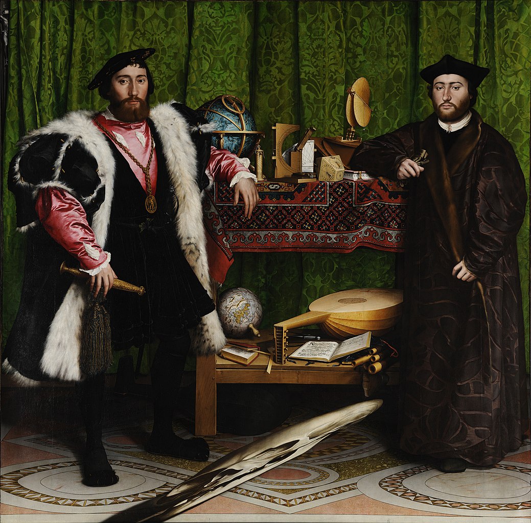
When beginning this project we had to question the world around us and see things that we would usually ignore. Literally or conceptually we had to look through film or photography at things not being as they seem. This could be something small or large but has to be something which makes you question it or take a second look. We looked at work such as Hans Holbein's “The Ambassadors” 1533 which presents a simplistic, traditional painting however with a very obscure, disproportionate skull. It was painted in such a way that only when you look at a certain angle can it be seen correctly. This cleverly plays with the norms of perception which is something that was uncommon in paintings at this time. The artist has painted it in a way that hides it at first glace as at first, the focal point is on the two men in the painting. It is only when you look closer that you see the skull and this is a perfect example of giving something a second glace and looking deeper into the work.

Image result for Hans Holbein the Younger “The Ambassadors” 1533

The National Gallery

At the national gallery I was able to observe older paintings that usually appear to be quite generic however when looking closer you are able to see a number of things that are not as they seem. This may be through the way the artist has painted (colours, textures) or through the subject of their piece. When in the gallery i found this piece which was a small sculpture which appeared to be 3D and have a lot of depth, however when looking from another angle you are able to see that it is very 2D with only a very small amount of depth.


I found this interesting as it intended to be visually confusing for the viewer. I knew that I wanted my piece to make the viewer believe that they are in a certain world or reality when they are not and I thought that this piece perfectly symbolised this.

Tuesday, 11 October 2016

Experimentation 

We had a range of photographs of models that we had to use a 2D mannequins to make garments on. These has to relate to the previous work we had explored so could contain the same colour, shapes, sizes or type of clothing.


After this we had to begin to plan our final task which was to create a garment of our choice, create it and photograph it in the style of fashion photography. The piece has to be 'wearable art', meaning not something that would be worn typically but something to be used only for the picture in the final outcome. This meant that we had to think in an abstract way when coming up with designs. 
We had to make a mood board of pictures which we used as inspirations when we were coming up with ideas but also showing what we had based out piece off of. My theme was based off a range of existing work. One being the Lady Gaga video featuring rico zombie, a model covered in tattoos making him appear as a zombie or skeleton. In this video there was him and Lady Gaga stood next to each other representing the 'man and woman' which was something that I wanted to incorporate by making a menswear and womenswear garment. Mostly, i was interested in the suits they were wearing and how I could use them in my piece. When looking into artists for inspiration I thought of Klaus Nomi, an artist who often worked with extreme suits, makeup and clothing so this was something I was interested in using. Finally, i also included Matt Bailey in my research as I wanted there to be a clear theme in my work and as his illustrations are cartoon like and somewhat childish, i thought that this would be an interesting aspect to incorporate.


Final outcome


Fashion - (Pathway 4)

The first task that we had to do in fashion was to chose a piece of existing artwork and create that into something that could be shown as an abstract garment. For this I chose to use work by illustrator Matt Bailey who's work i like very much. He has the perfect mix or beauty and horror in his work and I thought that this would be an interesting concept when creating my work. 

I chose this piece called The Lovers:


After making small 3D designs which I believe related to the piece i chose, I then photocopied these to make interesting and abstract patterns and designs. Using the photocopier I was able to distort the images in interesting ways to form something interesting to put on my mannequin. 

After teaming up with two other students we made a final garment made from only our photocopied work. 


Photo sequence


For my photo sequence I decided to make them extremely simple and did not make them show something happening. I thought that having my sequence tell blatant story was something that may be predictable so i preferred to show something that was subtly altering rather than ending being something els.
Animation

we had to make an animation with only 12 drawings, then take 24 pictures of them to make in into a loop. The animation had to show a change from one thing to another.


For my animation i decided to make a woman fall through a mirror and come out of the other side as a cat. This shows a clear change and is simple but effective. This, much like my vine also creates an illusion which I think is something important in film or animation as it is something that is not real life so gives an opportunity to present something impossible or abstract. 

Making a Vine

For this task we had to make a vine of 6 seconds which could only contain 3 cuts maximum and the theme could be anything we chose. due to the short films we had watched in class I decided to make mine involving some kind of illusion. 

Link to Vine -  https://vine.co/v/5rKviV2V95i

I roughly planned what I wanted it to contain which was someone going up to another person, tapping them on the shoulder then when they turn around they are gone. Then the second shot would be a pan across the setting to reveal that that they had teleported to another floor far away. 


Thursday, 6 October 2016

For our next task we had to take 5 images which represented different things, however these things were to be inferred, not presented obviously. These things were fall, happy, sad, echo and jump.

My fall image:

I found the fall image most challenging to come up with. This was due to the fact that it was hardest to portray in a vague sense rather than the obvious (someone in the air, an object falling) However when considering what I would do for my fall image I decided to photograph the end or result of a fall and i found that my hand landing in water was the perfect was of representing this. I also found that although the photograph doesn't represent the actual act of falling, the movement of the image speaks for this instead. I had to use a very high shutter speed to capture the water in the air as I didn't want the picture to be blurry. I also used a lower ISO as the light was very bright in the room where the photo was taken. 


My echo image:

While taking my echo picture i used a slow shutter speed to ensure that there was an extreme movement and blur from the figure as i believed this perfectly represented a sense of echo. In post production i also brought down the saturation to make the photo have a much gloomier and eerier feeling as this is something that I believe comes to mind when thinking of the connotations of the word echo. 
My fall image:
I particularly enjoyed taking my fall picture as i believe that it represents the theme in several different ways. One obviously being that the word fall is an american term for autumn which may be a very literal interpretation of the image, however this was not my intention when taking this image. I was interested in the way that the angle of the photo shows the perspective of someone who would be falling, rather than simply showing someone physically falling. I find this effective as it juxtaposes the elegance and fragility of the leaves and sky with falling which usually holds dangerous, negative and harmful connotations. I also find that the red colour of the leaves add to this notion and add further elements of harm and negativity. 

My happy image:


My happy image came accidentally when I was taking pictures of my friend during the day. Personally the picture perfectly represented the theme of happiness as the subject is my close friend therefore this a personal perception of happiness. However, to a wider audience the warm colours, rays of sun covering the camera and the subject being a pretty girl, the picture may also be seen as happy.

My sad picture:


My sad picture was the first image i took and was not planned. While walking past my brothers bedroom in my house I noticed the blue light from his tv which automatically reminded me of sadness. To get this picture on my SLR camera i had to use an extremely low shutter speed as it was so dark, therefore i put the camera on the floor on a timer so that there was minimal camera shake. I did this rather than using a tripod as I wanted to image to be from the perspective of someone looking up at the light. As the picture was taken I had someone walk through the shot and as the shutter speed was so low it made them very blurred. I really liked this effect and thought that it added to the overall sadness of the picture.

My crush picture:

I found that i could be most experimental with my crush photo as it is not something that could easily be shown in a literal way. The first thing that came to mind when considering the word crush was broken or breaking glass however I did not want simply capture this physically. I decided to project an image of smashed glass onto my friends face so that I could not only include the broken/crushed object but somehow symbolise a crush within someone emotionally.